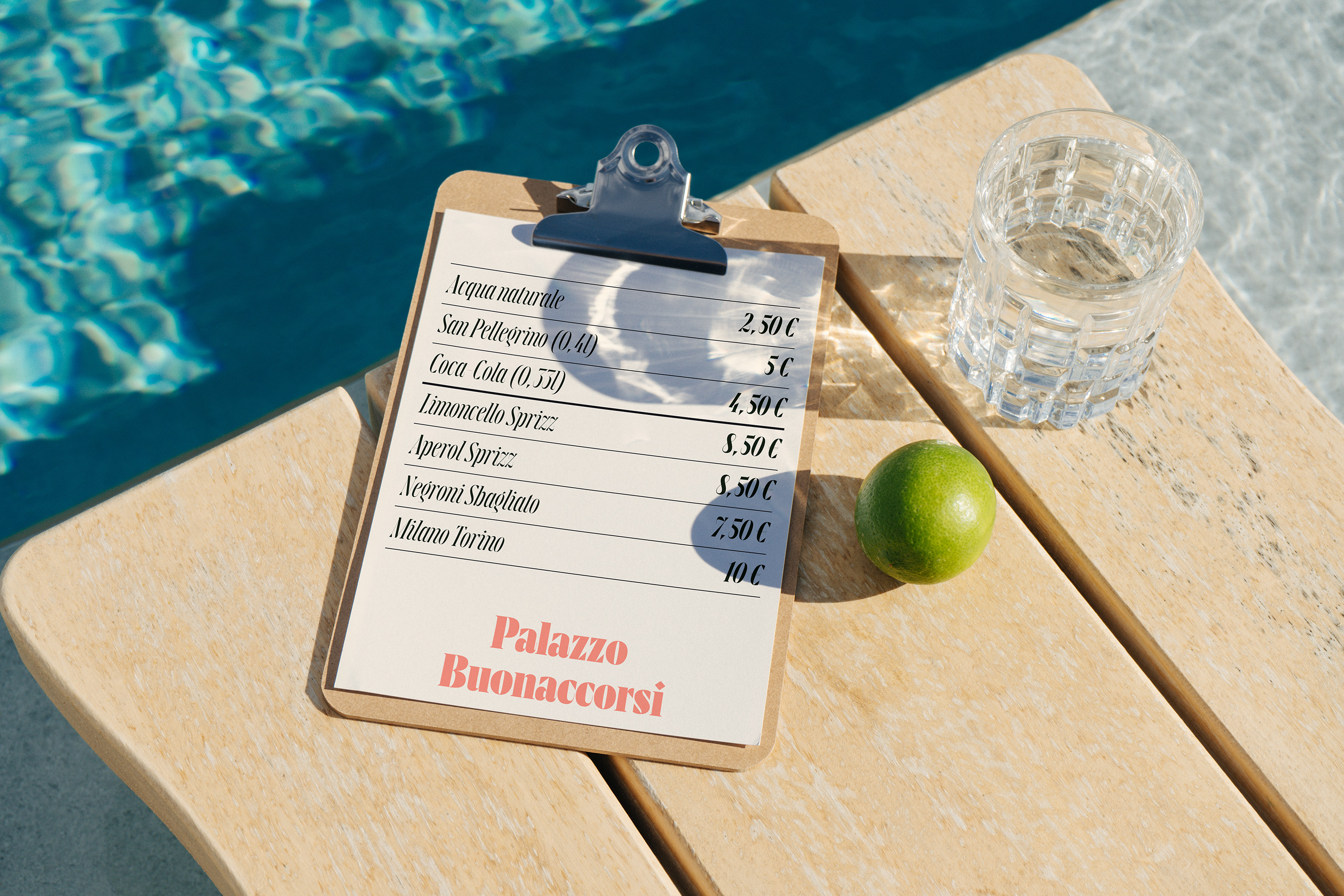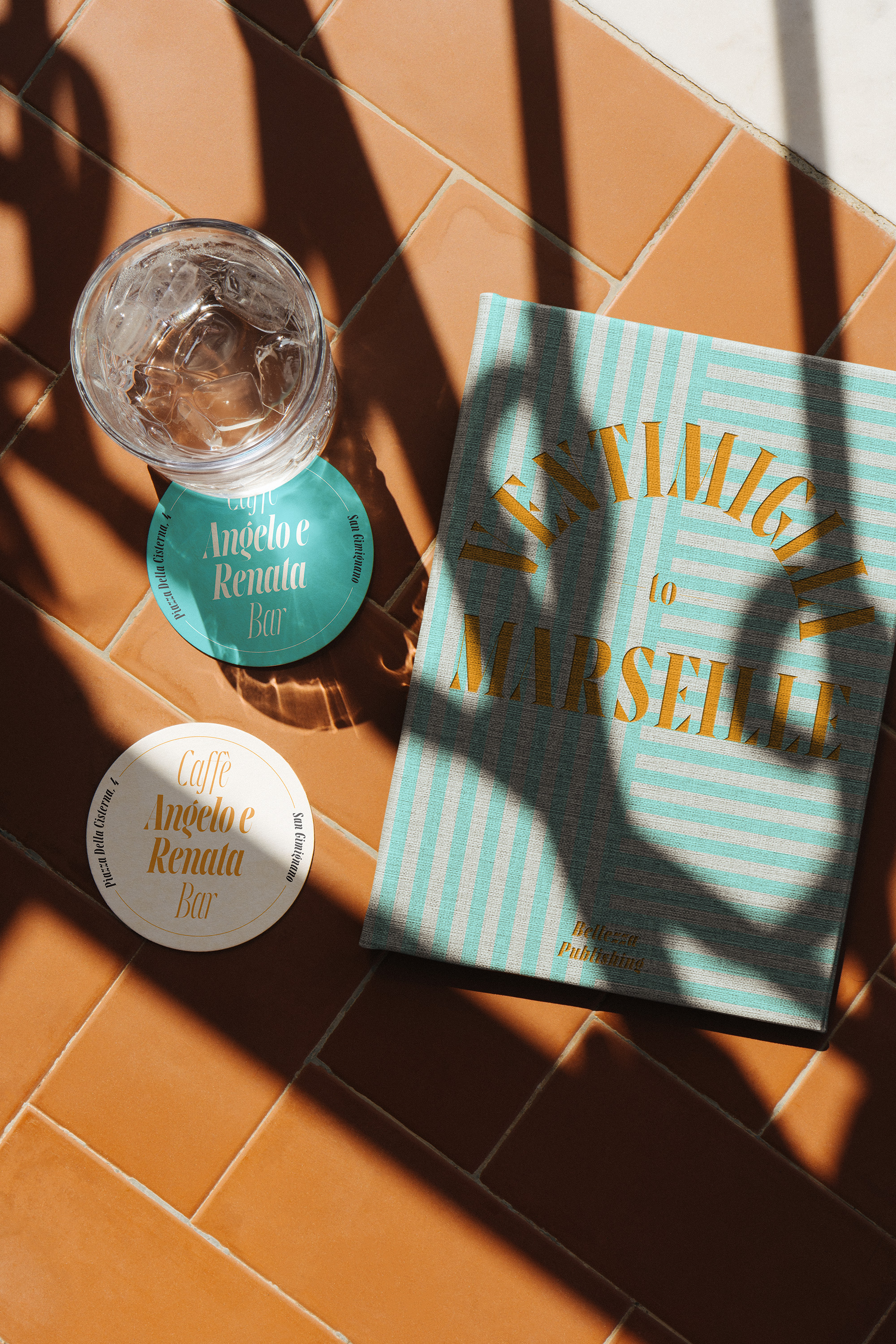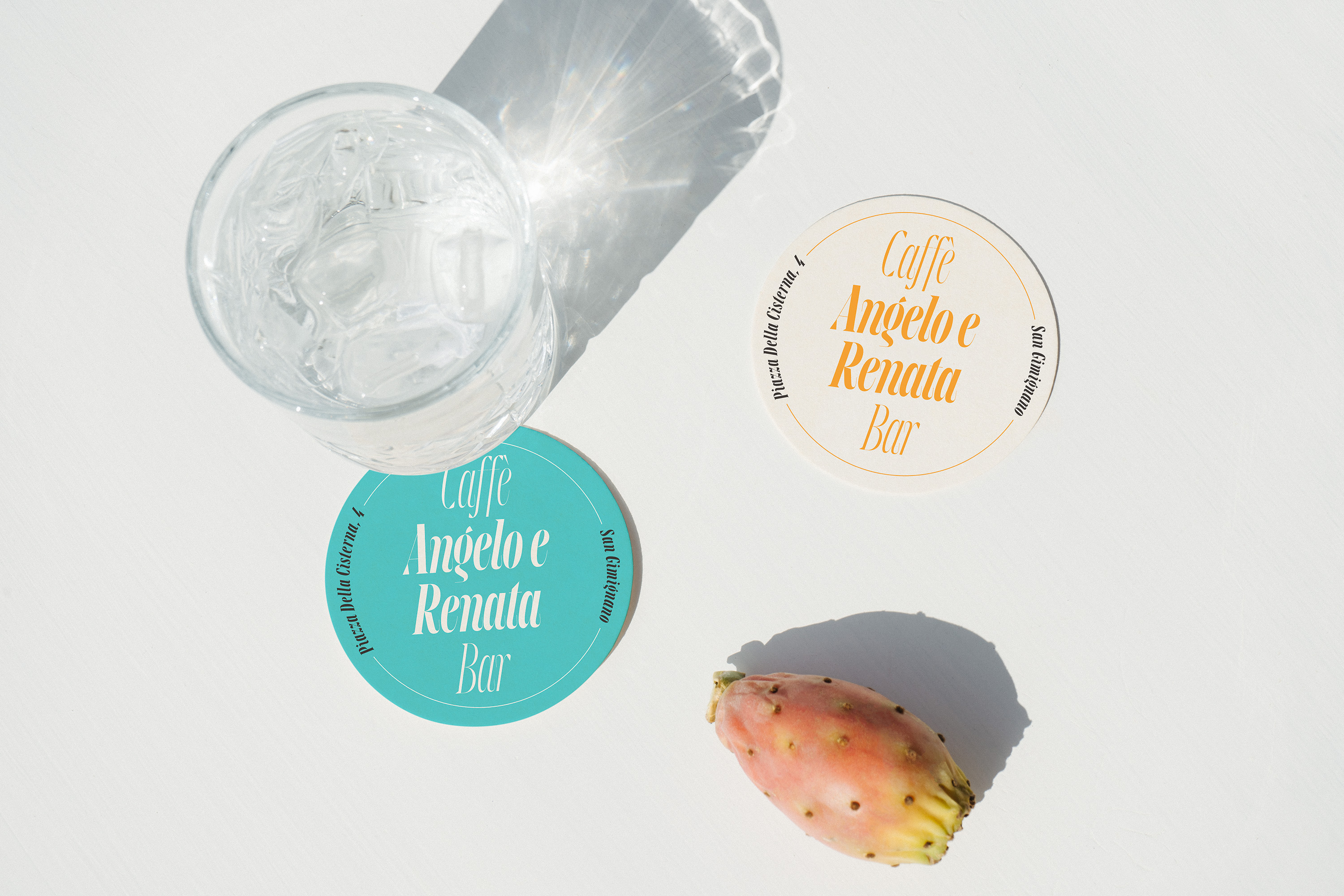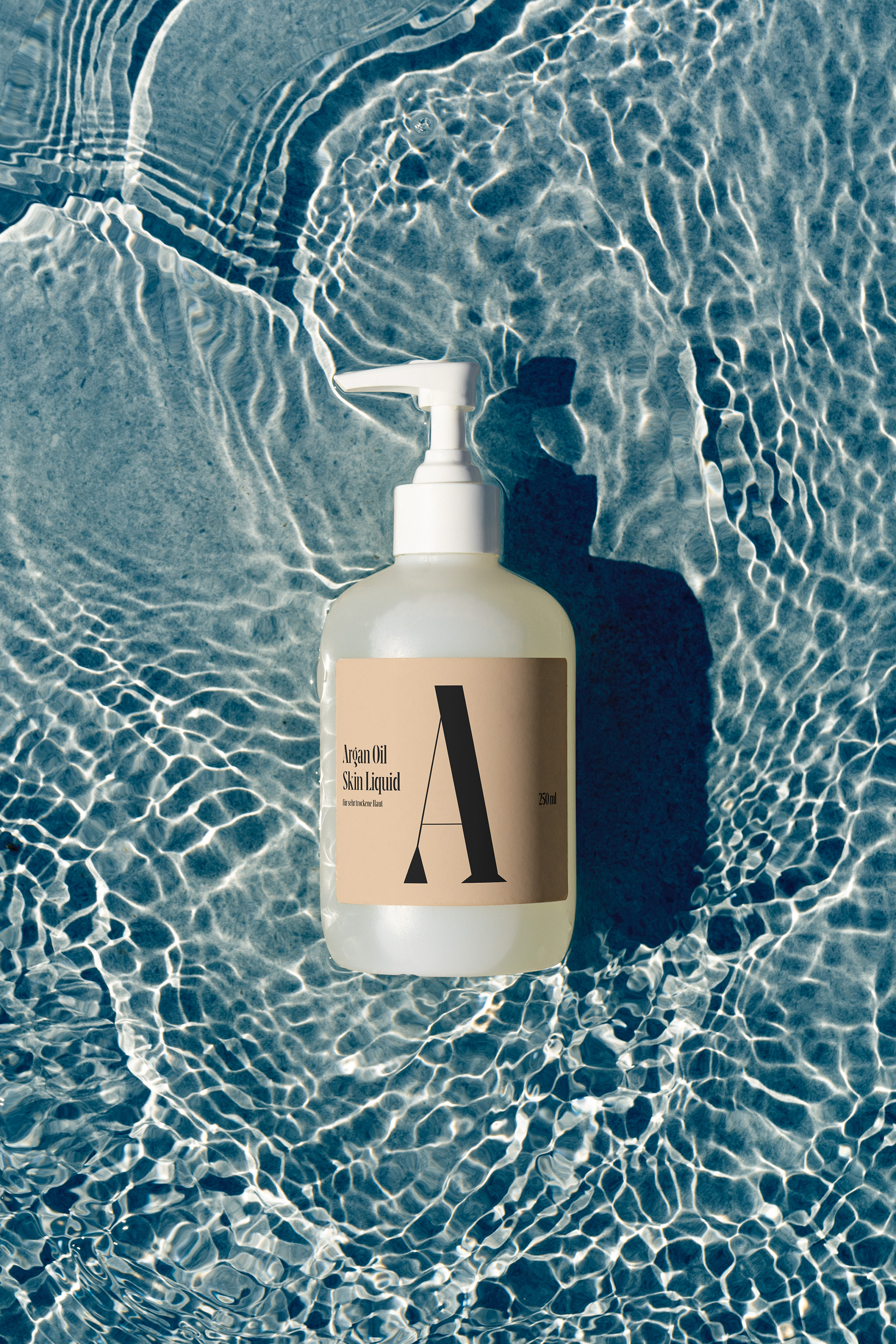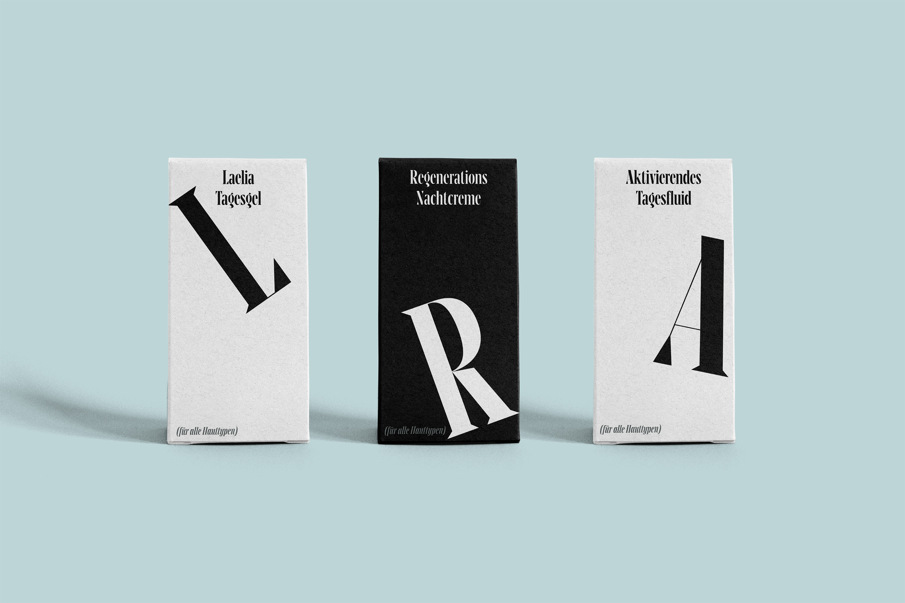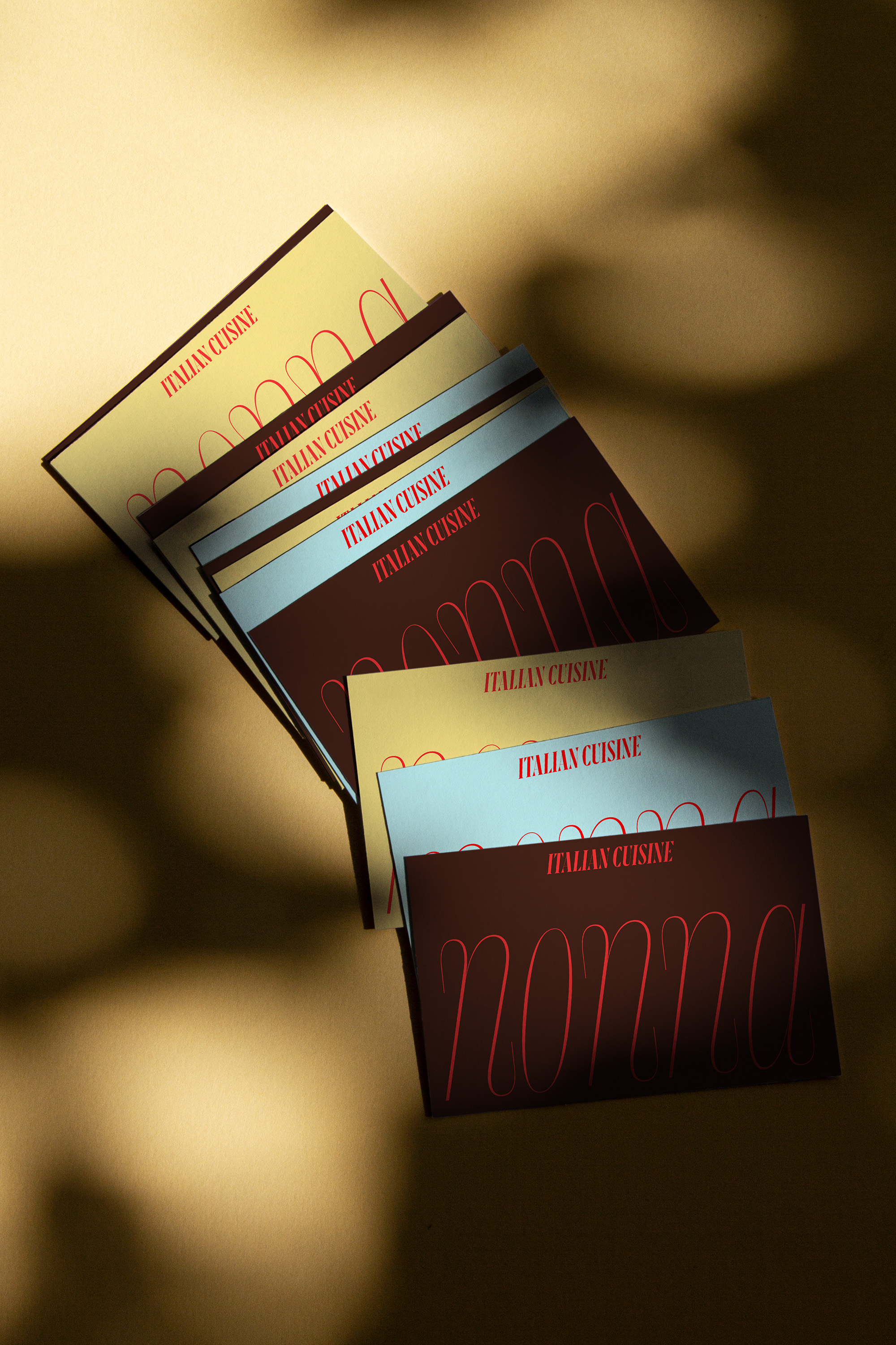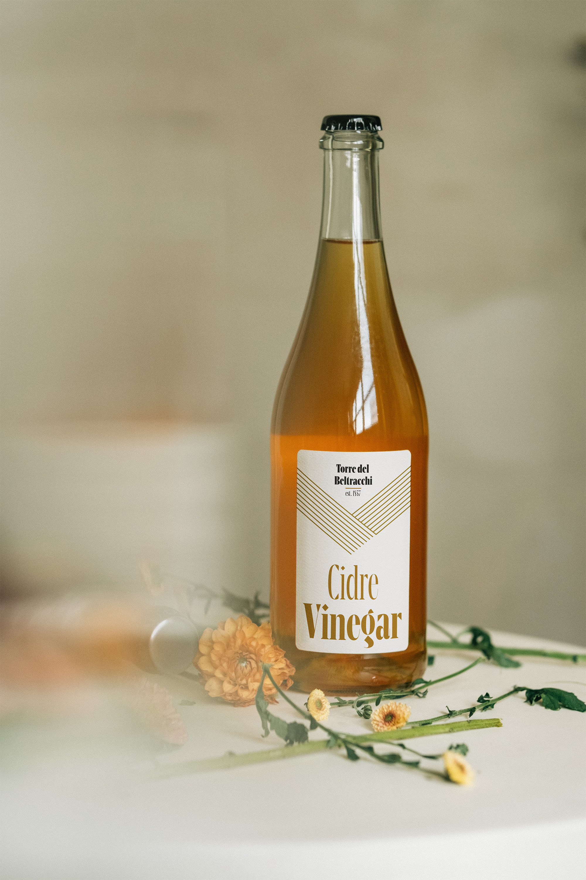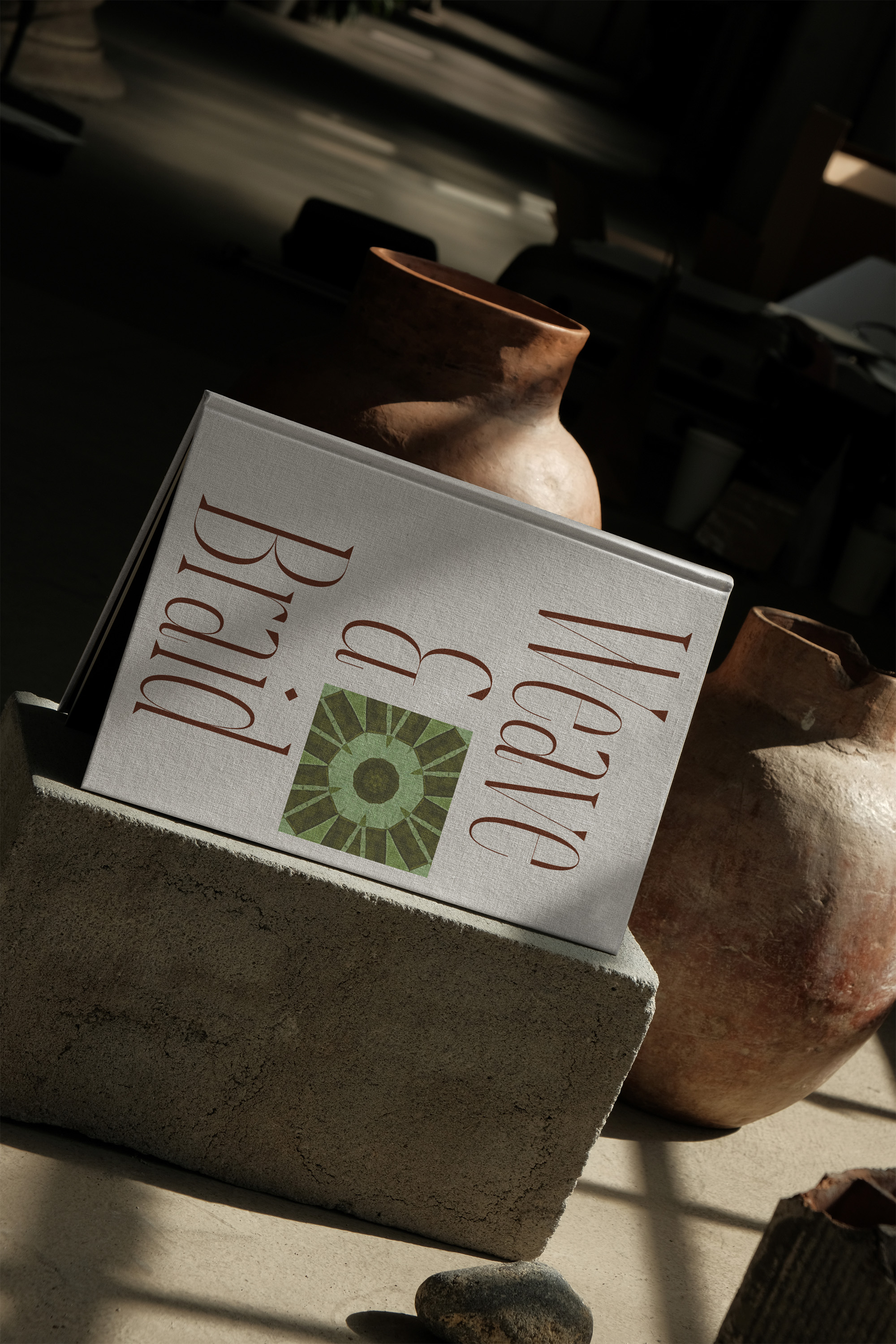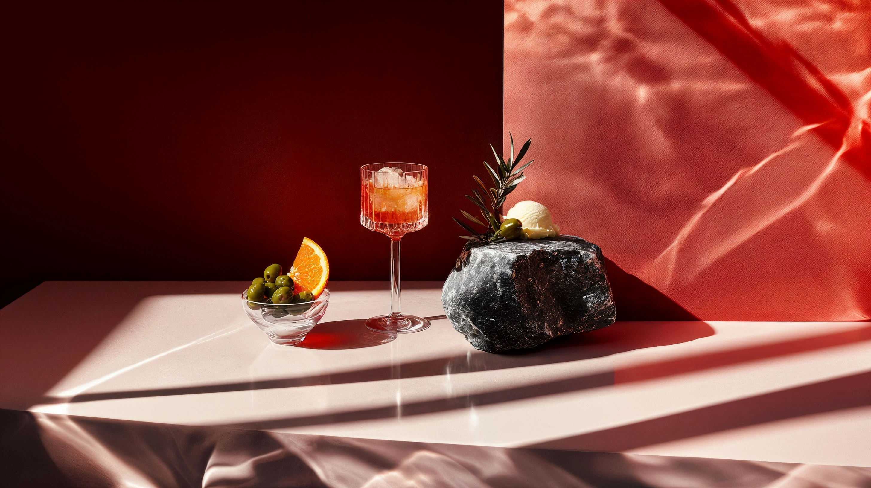

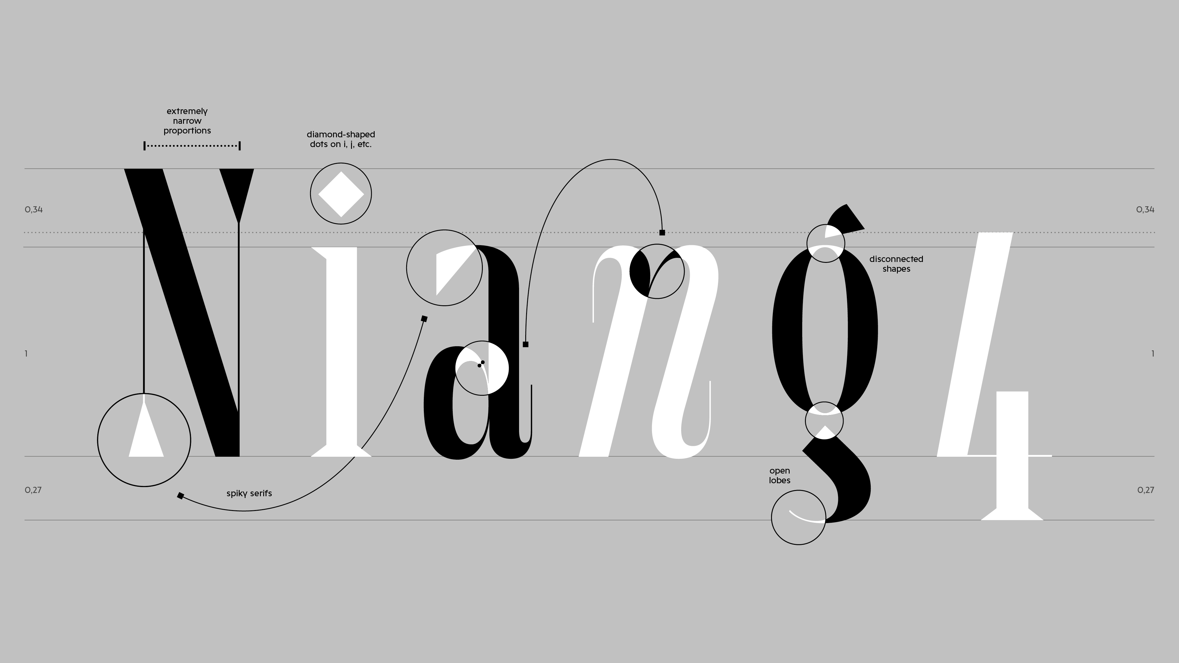
Maurizio feels like Italian bellezza as the evening sun accompanies the second glass of strong red wine on the shores of the Mediterranean. Maurizio is a display typeface suitable for big screens and big stages—the bigger, the better. Why? Because only at large sizes do Maurizio’s design features fully reveal themselves: razor-sharp serifs, open lobes like in “g”, twisted dots on “i”, “j”, etc.
The Italic, designed by Nina Botthof, adds some tenderness to the condensed and rigid design. The exaggerated end strokes in the lowercase letters create a very distinctive rhythm in the Italic styles while staying true to the original design.
Maurizio is an exploration into how far the concept of interpolation can be stretched in a superhigh-contrast display typeface. The goal to make the whole typeface interpolable from one extreme to the other heavily influenced the design. Only the two extremes have been drawn by hand: Hairline and Black, in both the Roman and the Italic. (Almost) everything in between has been interpolated.
Daniel Perraudin
Nina Botthof
Noe Blanco
2025
Afrikaans
Albanian
Asu
Basque
Bemba
Bena
Breton
Catalan
Chiga
Colognian
Cornish
Croatian
Czech
Danish
Dutch
Embu
English
Esperanto
Estonian
Faroese
Filipino
Finnish
French
Friulian
Galician
Ganda
German
Gusii
Hungarian
Icelandic
Inari Sami
Indonesian
Irish
Italian
Jola-Fonyi
Kabuverdianu
Kalenjin
Kamba
Kikuyu
Kinyarwanda
Latvian
Lithuanian
Lower Sorbian
Luo
Luxembourgish
Luyia
Machame
Makhuwa-Meetto
Makonde
Malagasy
Maltese
Manx
Meru
Morisyen
Northern Sami
North Ndebele
Norwegian Bokmål
Norwegian Nynorsk
Nyankole
Oromo
Polish
Portuguese
Quechua
Romanian
Romansh
Rombo
Rundi
Rwa
Samburu
Sango
Sangu
Scottish Gaelic
Sena
Serbian
Shambala
Shona
Slovak
Slovenian
Soga
Somali
Spanish
Swahili
Swedish
Swiss German
Taita
Teso
Turkish
Upper Sorbian
Uzbek (Latin)
Volapük
Vunjo
Walser
Welsh
Western Frisian
Zulu
Wanna try before you buy? Wanna know more about our special licensing model? It won’t get any easier (and fairer) Thinking about a custom font? Sure, let’s have a chat Just want to say hi? Anytime, drop us a line
